This post is the first of several as part of a Design Journal for a class I am taking in Representation and Interaction Design (E19.2015) as part of the ECT Program at NYU Steinhardt.
Please note that I include some bibliographic notes only as a courtesy and reference; this is by no means a properly annotated or formatted bibliography, though it is possible it will evolve as such.
Our first week’s readings were:
- Hall, Stuart. “Representation, Meaning, and Language.” (excerpt)
- Robert E. Horn. “Information Design: Emergence of a New Profession.” (from Jacobson, R.E. (ed.), Information Design)
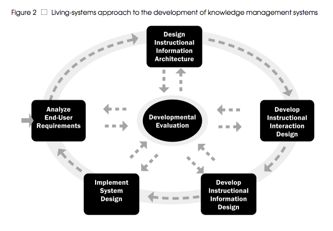
- Plass and Salisbury. “A Living-Systems Design Model for Web-Based Knowledge Management Systems.” (from ETR&D, Volume 50, No. 1, 2002)
First: Hall’s article. I have read selections from this text previously, though it has been several years. This kind of stuff fascinates me. It is one of the primary reasons I love teaching and learning languages. I love also that it is so abstract and philosophical — about how language and visuals construct meaning, but that it is conceptually created by the system of representation. There is a very strong argument here for teaching visual and spatial literacy skills alongside traditional textual literacy; any teacher who feels reading/writing is more important than other language strands must read Hall. Additionally, this is so crucial to understanding when setting out to design anything for learning purposes: the context of the culture, the meaning, the representation, and the language. They all work together (or against one another, at times). In a multicultural society, this makes design difficult, because meaning can never be fixed. No wonder countries like Finland have the “top-rated” educational systems; they are designing learning materials for a largely homogeneous society.
“Language can never be a wholly private game.”p.25
I LOVE this quote! The essence of language — and of communication — is that we share these representations and codes.
“This means that our private thoughts have to negotiate with all the other meanings for words or images which have been stored in language which our use of the language system will inevitably trigger into action.” p.25
Sit and think about that for a moment. To simply exist in the world, we must “negotiate” an understanding with others via words, images, and representation. That is a heavy-duty task, which we do without thinking on a daily basis.
I wonder how much better communicators we would all be if we were conscious of this challenge in each moment?*
The constructivist view of representation is also the reason, in my opinion, why things like poetry, music, and art are so beautiful — the meaning constructed at the “other” end (ie., the reader/listener/viewers’s end) is so unique. It is also the basis for the Reader Response instructional technique / philosophy in literature instruction — that there is no right answer. And, it links neatly to another reading from this week, from a different course: that of Paulo Freire‘s objection to the “banking” concept of education. Learners are not receptacles to be filled: we want them to make their own meaning.
Horn’s article was also interesting, but mostly because this is an aspect I know little about. Thus, it was a great introduction to Information Design, a relatively new “profession” and niche. I had no idea that the UK was (is?) a leader in terms of resources and development in Information Design, so this was interesting to read about. Again, I found a strong argument for teaching of visual and textual literacy in Horn’s article when he discusses Structured Writing:
“Structured writing . . . is foundational to some areas of information design. It provides a systematic way of analyzing any subject matter to be conveyed in a written document.” p. 23
Thus, the importance of learning how to organize and arrange information: it is a crucial skill in any kind of analysis. The section on p. 24 about iconic signage was also interesting (another argument for visual literacy in schools), particularly the study of international symbols. I especially think this quote is relevant:
“To create a true linguistics of visual language we need new concepts that focus on how words and images work together.” p. 28
But most interesting was the final conclusion, in which Horn basically says that this profession is still evolving. Huh. It is still evolving 10 years after the publication of this article!
The Plass / Salisbury article was the least interesting to me because it was so technical, and in the end I felt like the conclusions were a no-brainer to me, and therefore somewhat of a disappointment. Not that I think their research & development of the living-systems model is not important — it most certainly is. But their conclusion — that a design cycle to create an instructional knowledge management system works best when there is constant evaluation and regulation by participants — is pretty much a given when you come from an educational background like I do. Of course a system of learning works better when the students have a part of it. Of course a system of learning works better when you are constantly asking the question, “How’s it going?” and “What can we do better?” and then actually implementing the suggestions. To me, it is all summed up in the final sentence:
“The living-systems approach we described in this article aims to support the development of environments that not only allow individuals to regulate their learning process, but that indeed grow and change in order to accommodate learners’ needs.” p.54
I recognize that designing and implementing an instructional tool (particularly a web-based one) to do this may not be easy. Heck, judging from the lengthy process that Plass & Salisbury describe (approximately 20 pages), I have to surmise that it is major task. I get that. But in the field of education, the conclusion stated above is really old news and something that educators try to do daily — particularly if they agree in any way with philosophers like Freire.
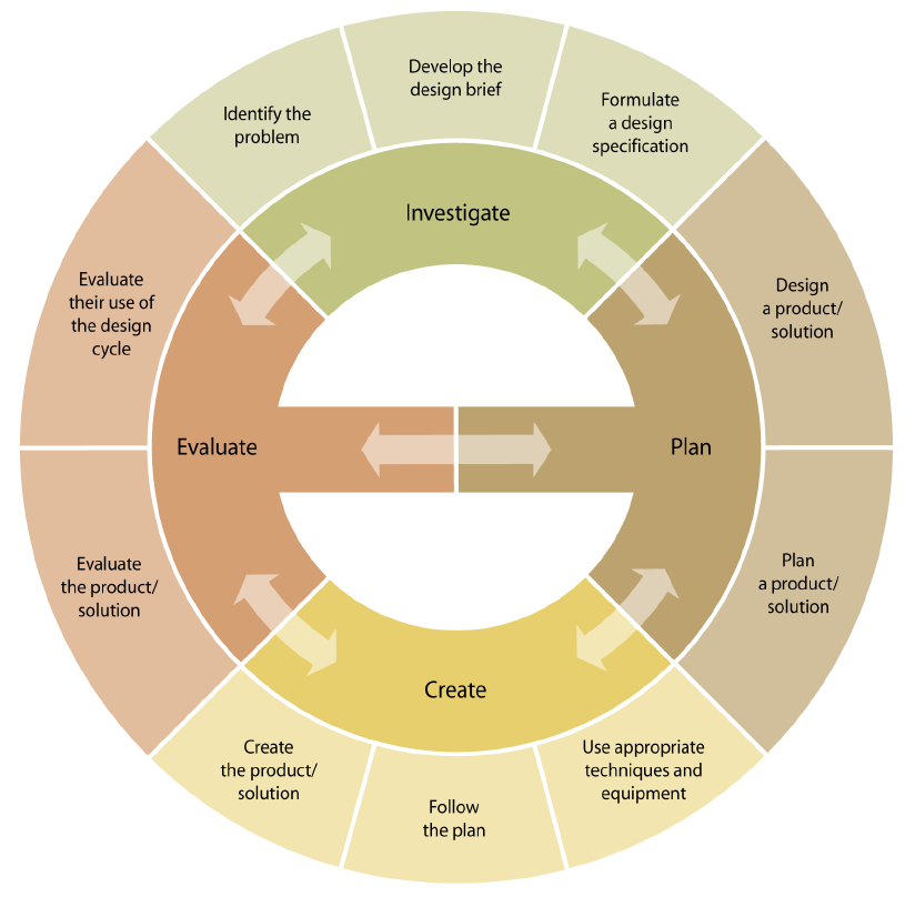
On a related note, I was quite pleased to notice distinct similarities between the design cycle that Plass / Salisbury come up with:

… and the MYP design cycle:

* As I read articles in this course, I am continuing to find many theories and ideas that are philosophical in nature. I am constantly reminded of Buddhist and other philosophical thoughts (for example, Sikhism, and various other yogic philosophies). I often wonder if I should create a separate blog just about those links. It truly is fascinating, especially when you get even further into studies of cognitive behavioural therapy and cognitive sciences in general.
Like this? You might also enjoy these:


