For a few reasons, I thought I’d jump into the meme that Kim Cofino, Clint Hamada, Keri-Lee Beasley and others got into. Firstly, I haven’t blogged since WayTooLong. Secondly, I did a similar commute-in-pictures thing when I moved to New York two years ago, inspired by Brighde Reed. Thirdly, I do like to compare my commutes not only with the people listed above (and others), but also with myself — compared to other places I’ve lived.
So here is Singapore!
I’ll start by saying that I rarely leave my apartment at the same time from day to day. Some mornings I am out the door at 7am, other mornings 7:15 and some (really rough) mornings, even as late as 8:00. I’m not good with mornings, or routines, so morning routines are really tough for me! It was for this reason that I struggled to keep the same taxi driver when I lived in Vietnam — I was never consistent (ehrm, reliable). Ooops. Anyway, On this particular Monday in Singapore — just yesterday — it was
- pouring rain
- the first day back for our school after a two week term break
- the first working day for the newest extension of Singapore’s Circle MRT Line — the line I ride to school!
I always leave the house with my travel mug full o’ coffee and part of my breakfast (the other part is usually in my bag, to be eaten after I finish the first part or when I get to school). I also have gotten into the habit of picking up the local my paper, which is a free morning daily here and it mysteriously appears outside my door without fail every morning! It’s been several years since I’ve had the opportunity to read an actual newspaper in English, so I think this is kinda fun.

As I got to the bottom of the building, I realized it was raining harder than it had been earlier and that I would need to dig this out of my bag:
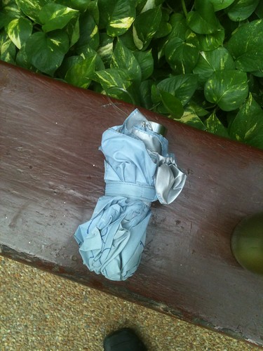
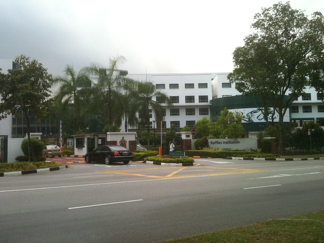
Juggling my iPhone, coffee, breakfast, and now umbrella, I walk out the front gates of my building, and take a right. Directly across the street from my apartment building is Raffles Institution (RI), one of Singapore’s “premier” private secondary schools — many of Singapore’s presidents, prime ministers, writers, and most successful CEOs have graduated from here. It’s also Singapore’s oldest school, starting up in 1823. And, as you might imagine, it’s a ginormous sprawling campus that takes up several street blocks. It’s a new, modern, attractive campus and is hard to miss!
It’s about a 7-minute walk to the Marymount MRT station, and those RI students are usually streaming out of the mouth of the station (easily identifiable here– the girls are actually students of Raffles Junior College, affiliated with RI).
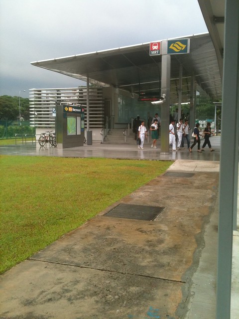
If I leave the house earlier there are normally more students, but on this particular day (did I mention it was a Monday?) I left at 7:40 which is a little late for RI and Raffles JC. Just before I enter the MRT station, I stash my coffee mug into my bag because NO food or drink are allowed on the MRT. (I’ve usually finished the first half of my breakfast by this point!)
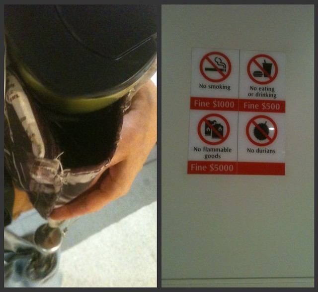
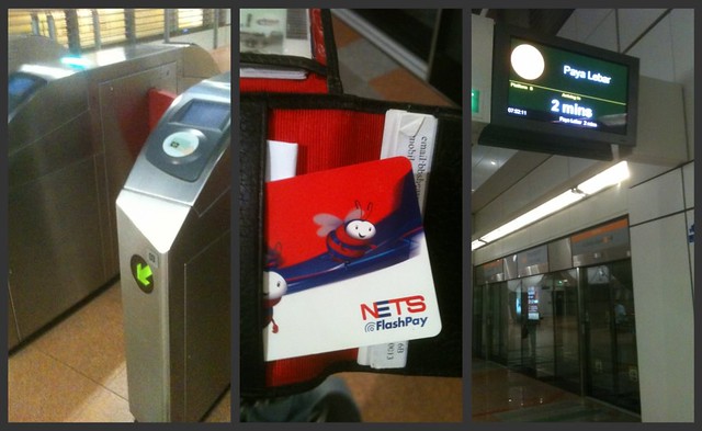
Down the escalator stairs, through the fancy MRT gates with my FlashPay card, and it’s never too long to wait for a train. On this particular day things were a bit chaotic on the platforms because it was the first day that the Circle Line was going in “the other” direction, so there were some confused people milling about. Those of you who are familiar with other subway systems – note the glass doors on the platform. I like that Singapore’s MRT really works hard to minimize safety hazards.
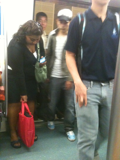
Typically when I get on the train, it’s not too busy. This is one of the reasons I get on at Marymount, to be honest. My apartment is actually the same walking distance to Bishan MRT in the other direction — a station that’s only one stop away from school. However, I opt to get on at Marymount instead most days — two stations away — because the crowds are really crazy at Bishan (I mentioned I’m not good with mornings, right?). 🙂 It’s totally worth the extra 10 cents in fare.

But by the time the train gets to Bishan, the next stop, the crowds pile on and pretty soon we’re all squashed in.
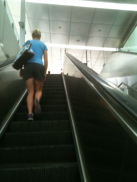
The next stop is Lorong Chuan and that’s where I get out. Out the station and up the escalator this time…
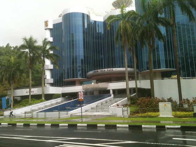
From here is my biggest “hike” — a 10 minute walk from the station to school. It’s an easy walk along a semi-busy road — not too bad at all. And I pull my coffee out of my bag, too! If I’m lucky I run into my colleagues on the way and so we chat and catch up. Today I didn’t see anyone I knew, though. Adjacent to the station is this big building: the New Tech Park. Most of the young working professionals who get off the train with me end up walking towards here.
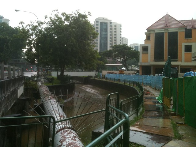
I pass several residential buildings, including one under major construction, and another school. At one point I cross over one of Singapore’s (in)famous canals: (keep in mind it’s still pouring rain!)
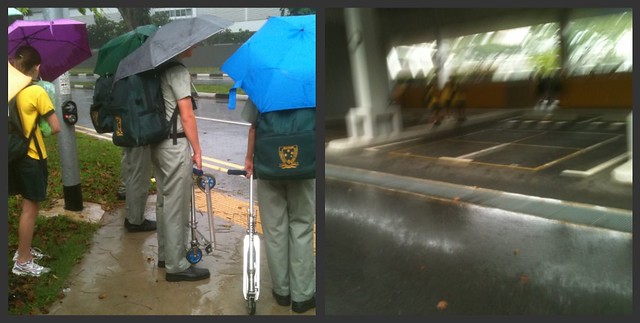
At the corner I wait with a pile of our students and parents for the light to turn so we can cross the road. Normally the bus bay Gate isn’t open for us to enter — the pedestrian gate is another 200 metres ahead — but on Monday I think the guards felt sorry for us because it was such a downpour! We ran in — I tried to take a photo but it was raining so hard and I couldn’t stay still!
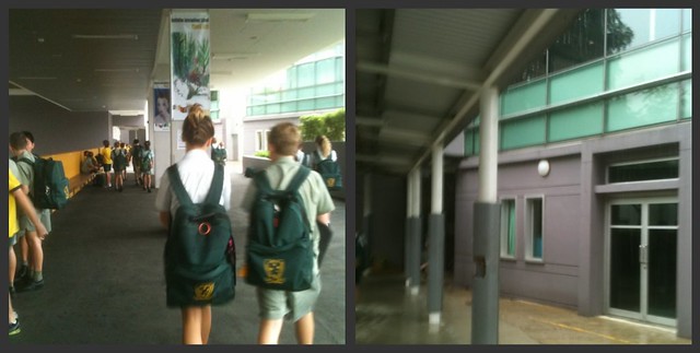
Under cover, I walk towards the school block where I work. Above me is the Senior School, for Years 10-12. The glass building is where I’m headed — that’s the Middle School block!
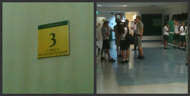
Through the doors… and up more stairs!
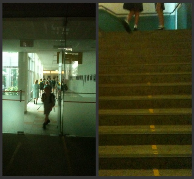
Third floor, where I round a corner and walk through the Year 8 pod area.
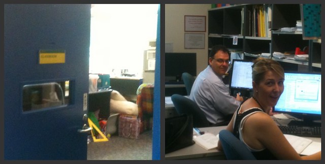
Ah, here we go — the Year 8 staff work room, where I currently have a desk. Here are two of my lovely and friendly year 8 colleagues to greet me on the first day back! Hi to Andrew and Bernadette! (Sorry about the photo, Andrew!)
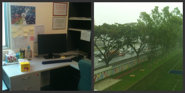
And here’s my desk. Wow, still POURING out there — that’s the view from my desk. I got a bit wet. But despite that, am very ready to start the day!
Hmm, so who should I tag? I think Brighde Reed, Jessica Allen, and a new Twitterfriend, Melanie Shurtz.
**all photos are mine, unedited! be kind!
