Oct 202009
 

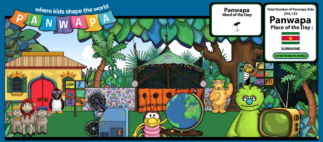
We’ve been asked to critique the Sesame Workshop’s Panwapa site, a “global awareness curriculum site” for 4- to 7-year-olds, according to Sesame’s press pageScreen shot 2009-10-20 at 1.42.55 PM

When you first arrive on the site, one of the characters instructs you to click the globe to explore, and so I did. This led me to a place where I could create my own Panwapa kid, apparently. I did not know what this meant, but I signed up anyway. I created my own Panwapa kid and my own house, too. Both were pretty-customizable. However, even a 7-year-old would have had difficulty with all the choices, and most certainly would need guidance from an adult while doing this. (It turns out this thought would reappear throughout my short Panwapa experience.) I also was struck with the thought of how many of the customizable items — food, crafts, and clothing, for example — were rather stereotypical. And I further wondered about the value of these stereotypes in an interactive game for pre-schoolers. Do we want all 4-year-olds to think that everyone in Asia eats only rice? Perhaps I’m over-simplifying, but it is worth considering.

After creating my own Panwapa kid, I was shown the map of all other Panwapa kids. I did a bit of exploring, but that got boring really quickly and so I decided to click the “Treasure Hunt” button. This invited me to a game where I had to find other Panwapa kids who liked certain things. There were three rounds:

  1. Find a Panwapa kid who likes traditional American dolls.
  2. Find a Panwapa kid who likes sharks and ice cream.
  3. Find a Panwapa kid who likes sharks, ice cream, and tennis.

For each level, I had to click through many (like, more than 10) kids to see if they were a “match.” I am not sure if there was an easier way to do it, but I did so by clicking on the “Activities” and “food” buttons, and then scrolling through the kids to see what they liked. It took some time, and wasn’t all that engaging, except that I was praised by the character every time I got something correct, which was kinda nice. And at the end of it all, I got a Panwapa card for my collection. It wasn’t clear to me, however, what I could do with that card later.

I also viewed the movie game, as per Frank’s request (clicking on the little bug’s film projector). This was so confusing to me. I did not realize until the end of the film that the goal of the film was to garner appreciation for learning another language, and going to school. I thought, as I was watching, that the film was more about the marginalization of the Maasai people in Tanzania. After all, Moses says, “We are not allowed to speak our language in school” and he talks about how learning this second language was hard, but it got easier. Yet, the little bug character at the end says something to the effect of, “Did you see that? Moses learned another language to teach his community!” as if this is the coolest thing since sliced bread. What I was thinking was that obviously Moses was sent to school as a fortunate one in his village — I doubt all kids in Tanzania are going to school, especially minorities like the Maasai. And he was probably sent because he is a male, and there was probably an expectation for him to teach his community because he is probably one of only a few in the village who get to go to school.

At the end of the film, the “game” begins: watch the film again and whenever you hear Moses speak Swahili, click on the Panwapa button. What??? I gave it a shot. Apparently he does this 4 times, but I only heard / saw 3. And I am an adult who speaks 4 languages! How on earth would a 4-year-old be able to get that? If the goal of this section was to teach appreciation for other languages, I definitely think it could have been done differently.  Further, I wonder if this “appreciation” lesson is age-appropriate for 4- to 7-year-olds.

It was not until after I played these games and clicked around did I find out what Sesame Workshop’s goals were for this site, and I have to say I was really surprised. Apparently Panwapa is meant to :

[help] children gain empathy for others while encouraging a broader international perspective.

You can read more detailed information about Panwapa’s educational framework here [pdf].

Frank asks, “Does it hit the mark?” My answer, as an educator: No.

It does, however, do a few things well. I identified the following problem-solving features in my brief (20 minute) exploration:

  • question posing (these were peppered throughout the treasure hunt)
  • identifying relationships (implicit in the treasure hunt)
  • gathering information (definitely actively used in the treasure hunt)
  • interpreting data (at the end of the film there is a graph provided about where other Panwapa kids go to school)
  • scanning for clues (in the film game)
  • ability to explore (this is huge, especially on the home page — and it should be, as almost all learning for this age group should be exploratory, in my opinion)
  • identification of pattern and sequence (in the film game)
  • choices – multiple answers (in the question at the end of the film game)

Other things it does well: in terms of affordances of the interactive technology — this is quite good. It was almost always clear as to what the interactive features do. E.g. if I click on the globe I will go to a map; if I hover my mouse over a character, he will speak; etc. In this sense, I did not find it difficult to navigate. However, I am not sure I could say the same for a 4- to 7-year old. In particular, I wonder about the home page, as there is so much to look at and click on. I wonder if it is too much for a wee person of that age; it could be overwhelming and end up being disjunct with no lessons learned at all.

I guess I’m not saying that Panwapa is a total failure, but no, it does not hit the mark.

Like this? You might also enjoy these:

Oct 132009
 

If I Had Something to Say by re_birf
Attribution License

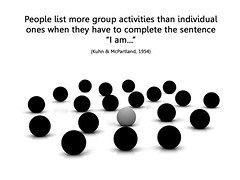
This week we’ve been asked to jot down / sketch / brainstorm some ideas about our final design project. I was pretty stumped for a while, and I’m still not sure I’ve really got any ideas. I have several jotted down in my (paper) notebook and have been letting them “sit” in my mind for the last 4 or 5 days. Generally they all come back to writing and how to make it more of a social, interactive experience. Basically, I am uncomfortable (always have been) with the stereotypical image of “writer in solitude.” While I agree that at times one can write better when sitting alone, I also think good writers can emerge from a supported community. It takes some balance. I’m not really keen on teaching / instructing people how to become better writers in solitude. I’ll leave that for Sark, Natalie Goldberg, and Julia Cameron. I’m much more interested in how to capitalize on the hive mind and create some solid pieces of Writing For The People.

i am by Will Lion
Attribution-NonCommercial-NoDerivs License

Robert Scoble tried a variation of this using FriendFeed and Twitter, but I am much more interested in the idea of having some kind of platform that makes this all possible — that your audience can give you feedback as the ideas are being generated, and that parts of the writer’s words can be shared, and critiqued, before the piece is “finished.” Or perhaps the piece is never finished? I’d like there to be some element of audio / video, as well, so that users can comment this way and so that the focus is not entirely text-based. I basically want writing — that is, communicating via text — to not be as laborious and text-heavy as it is now. In order to blog these days, you have to be pretty text literate. And while that is fine for those of us who are verbal and educated, what about twelve-year-olds who have something to put out into the world, who want to refine their writing, but want some help and interaction to make their writing really phenomenal?

Perhaps I’m thinking too grandiose at the moment…

What’s been sticking out to me when reading Saffer, Sharp, Norman, and Adams is how important it is for the affordances of the interface to be almost instinctual, or intuitive. I also am intrigued by the feedback/ feed-forward ideas Saffer discusses in Chapter 7; it is striking to me how few programs / platforms incorporate this. The key, I guess, is to have everything seem simple to the user but in reality the complexity is all hidden from the user. Which has got me thinking — if it is intuitive to me, how will I know it is intuitive to others? Saffer in particular talks about how so many designers design things for other designers, and how this is just not cool. I have to agree. So I am wondering — hoping? optimistically? naively? — that not being a designer myself or having that background will actually be an advantage in this particular project. Or is that what every designer thinks when they first start out… ? 😉 I suppose it comes back to what we’ve been learning in every course so far — a tenet that is fundamental to educators in general — know your user. Do research, talk to them, study them, find out how they will use things, how they think. This reminds me also how intrigued I was about all the user research that went into Quest Atlantis, having read about this for a different course. Knowing your user is key, and I suppose one cannot assume ever that they are just like oneself! 🙂

I have to admit that I’m really also loving the ideas of one of my classmates, Poukhan. Check out her ideas. I am tempted to scrap my interactive writing idea altogether and ask if I can join her!

Like this? You might also enjoy these:

Oct 072009
 

Stay Warm by Erik Charlton
Attribution License

Frank gives us a few web resources now and then that he wants us to look at; whether for inspiration or understanding, I’m unsure. Whatever the case, they are usually interesting reading / viewing, and probably things I would not find myself were I surfing around on the ‘net. Communication Arts magazine has reviewed many different kinds of interaction designs, and given awards to a few. They’re worth checking out, if for no other reason than just to see some of the new, cool, hot designs on the market these days — everything from web design to physical spaces. I’ve been bouncing around their site, looking at different designs and trying to understand what makes them “good.” While sometimes that is obvious, what I find even more fascinating than the designs themselves are the responses to the question CA mag asks of the designer:

What was the most challenging aspect of the project?

Some responses: (emphasis mine)

  • “The most challenging part of this project was keeping it simple, staying true to the core ideas and avoiding ‘feature creep.’ . . . I had to stay focused on the original goal—not reinventing the wheel but rather enhancing it.” Sebastian Bettencourt, art director/writer/interface designer/information architect/project design and development, Beyond The Fold
  • “One of the primary challenges to designing TokBox was understanding and embracing user interactions that are unique to live video calling.” Chris Fox, design director, TokBox
  • For the Loudspeaker team, the big challenge was caring for the original idea—amplifying the voice of a great cause—as we built the site.” Scott Brown, creative director, The LoudspeakerSite
  • It was a challenge to keep each individual story entertaining and short (there were many ideas that were thrown out because they were too long or just not fun to watch).” Trevor Van Meter, creative director; Luke Lutman, Flash programmer; and Brian McBrearty, composer, Crappy Cat

And this question:

Did you learn anything new during the process?

Responses:

  • “I learned that inspiration comes from experience. It comes from rethinking everyday activities and from reconsidering everyday interactions.” Sebastian Bettencourt, art director/writer/interface designer/information architect/project design and development of Beyond The Fold
  • “One of the first things we had to face was the huge risk of that transparency, and what it really meant. No approvals. No editing. In the end, it was actually freeing to give up all control to the audience.” Gary Koepke and Lance Jensen, executive creative directors, Modernista!

This has got me wondering about how design influences learning. How conscious are educators of keeping it simple, staying true to the original goals, giving students experiences (rather than instruction), and giving up control to the users? How would schools be different if we did all of this, all of the time? Would there still be schools? If so, what would they look like?

Like this? You might also enjoy these: