Sep 292009
 

Teachers — myself included — are always telling their students that they should connect their learning to themselves, to something the student feels passionate about. We know that this principle is largely based upon constructivist learning theories. It’s no secret that I am generally a constructivist (though I spice things up with aspects from other theories too), so I am taking a constructivist approach to my assignment this week. This week, I’ve been assigned to critique an interface, based on the readings I’ve been doing about design. Frank said we could critique pretty much anything that is an “everyday object” or even wider, to a kiosk or web page. I’m choosing something near and dear to my heart: a coffee travel mug.

If you know me well, you know I have a substantial collection of coffee mugs in my ownership. I don’t collect them for any reason other than because I love to drink coffee, and I love that travel mugs make the drinking of coffee so wonderfully convenient. The mug I’m critiquing today is this one (Fig.1):

Fig. 1

Fig. 1

Overview:

Fig. 2

Fig. 2

This travel mug is a standard 12oz. (“tall”) sized mug made by Starbucks. It has a rubber bottom approximately two inches wide, and is approximately 8 inches tall. The base of the lid is about 3 inches in diameter, meaning it has a larger lid than base. (See Fig. 2) The mug’s exterior is made of hard, clear plastic, while the lid is made up of rigid burgundy plastic. Inside the lid, there is a rubber ring around the diameter of the lid where it screws onto the main part of the mug. (See Fig. 3) The lid screws on inside of the mug itself. The lid also has a flip-top with a “lip” made of rubber, a different material than the plastic which makes up the rest of the lid. The rubber on the “lip” is meant to completely close the hole in the top of the lid which would normally be used to drink from. In effect, closing the “lip” seals the container, though Starbucks is quick to point out in the material that comes with their products that they do NOT guarantee their mugs to be spill- or leak-proof.

Mapping:

The mapping of this object is fairly obvious in some places, but less explicit in others. For example. It is obvious where one should put his/her mouth — over the hole in the lid. Likewise, it is also obvious that to control the fluid entering / exiting the container, one needs to move the lid. It’s not well mapped as to where one is supposed to hold the mug, so I assume one is meant to hold it however necessary to get the liquid out of the container and into one’s mouth, which I believe would be the goal (well, it is in my case, anyway!). Thus, experimentation is again needed to tilt, hold, grip, and rotate the mug itself. This is not explicitly mapped, though I have a hard time imagining anyone would find difficulty with it, assuming they have some prior experience with a drinking container of some kind. In that sense, it is intuitive, but it is not mapped.

Fig. 3

Fig. 3

Affordance:

If affordance is about giving the user an idea or clue of how to use something, then I will say it is less obvious how to “unlock” the lid when it is snapped shut over the lip. The lip protrudes over the edge of the lid, so it is implied that one has to use his /her fingers to pop it open, but there are no directional instructions (words, symbols).  Also much less obvious is how to open the lid. There are no arrows or other visual indicators to show how or which way to get the lid off of the main mug. It is only by experimentation or trial and error that one learns that it screws off, in the “standard” way (“righty-tighty, lefty-loosey”). Regarding affordance of what to do with the entire object: while it is intuitive as to what to do with this object, I might say that it has affordance in this respect (ie., it looks like something you are supposed to drink out of). However, as I stated earlier, this is not necessarily well-mapped and relies on the user’s previous experience / knowledge. One who did not have any experience with previous travel mugs, for example, might think that the main mug part of the object could be used as a vase, or a pencil holder. Thus, the design of the product itself does not have any affordances made to make it explicitly clear that this object is solely for drinking coffee.

Function and Feedback:

Considering what the product has been designed for, I think it achieves its purpose in a basic but adequate way. It holds coffee. The lid closes and thus it is relatively good at keeping the coffee inside when it is not being consumed. However, the function of stability is not as well accounted-for as it could be. Because the base is approximately 1 inch smaller in diameter than the top, the mug is not especially stable. This means it is easy to knock over, tip, or not set down properly, which could lead to the tragedy of spilled coffee. Even if the mug lip is closed over the lid, some does leak out if the mug is completely turned on its side. This is despite the design including a rubber ring around the lid and the rubber “stopper” in the lip. Additionally, the container is not insulated and so coffee does not stay warm for long. I might also add that the design is not compatible for rugged lifestyles, as when dropped, the item does crack.  (See Fig. 4) This is despite the very firm and heavy plastic used to create the product.

Fig. 4

Fig. 4

Conclusion: Is this well-designed?

The interface for this mug is fairly well-designed, but it could be better. More specifically, I think this kind of object could be more ergonomically designed to fit neatly in a person’s hand (mapping). Also, I think more affordances could be made in terms of how to unscrew the lid and how to open the lip of the lid. Lastly, I think the design could be improved by widening the bottom of the base. This would prevent more accidents in terms of spillage, which could potentially be dangerous if the liquid inside is very hot.

Last thoughts:

Hmmm, I wonder if hypothetically Starbucks could ever be sued for poor design if the mug tipped over after one had just poured very hot coffee inside and the lip was open because I couldn’t figure out how to close it properly, or the lid not screwed on completely tight?

I’m kidding, of course, but it is food for thought, isn’t it? Is it my fault that the coffee mug is not designed for stability? or that I can’t figure out how to get the lid off?

What implications does design have for things like regular instructional planning and strategies? What about the design of a teacher’s classroom — how the desks are arranged, how the furniture is set up, where the whiteboard or projector screen is? What affordances are you providing for your students? How well-mapped is your project handout?

I have never thought about design in these ways before, but it certainly has got me thinking about larger implications. I’m even now thinking about how I can “re-design” my living space!

Photos are all mine.

Like this? You might also enjoy these:

Nov 212008
 

I’ve tweeted it before, last time back in June:

I regularly ask my students to reflect on their work and our class in general. Embedded in this reflection task is my not-so-subtle request for feedback on how I’m doing as a teacher: Are you learning something? If so, what?

… and I hope that the answer is something along the lines of what I think I’ve been teaching. Honestly, the response usually is, and so I give myself a pat on the back and move on.

But every time – and I do mean every time – I ask my students for feedback, I get at least one surprise, sometimes several. In fact, now that I think about it, I realize that perhaps this is the main reason I continue to ask my students for “please-may-I-get-inside-your-head” feedback: because my students (especially the middle-schoolers) always surprise me, and I get such a thrill from it. I mean, yes – I am asking for feedback to inform and guide my teaching. Everything from next week to next year is considered and reconsidered as I chart, graph, and make notes about what my students have said. But sometimes I am merely charmed by the simplicity and honesty of my students comments. Further than that – and this is when it really gets good – is when I’m challenged by them.

My mid-year feedback and reflection requests are very open and not at all numerical, incidentally. I allow students to respond in any number of words, in a Zoomerang online survey with an open text box. You can see here what my questions look like.

Note that if you’d like to see an entire sample survey, check one out here – you’ll have to fill something in the boxes to get past each page but don’t worry; I’m pretty sure I’ll know you’re not one of my middle-schoolers!

I’ll share some examples from the most recent batches, submitted this week, as we roll into the second quarter of our school year at UNIS Hanoi. First, Rebecca in 7th grade, who knows what she is getting from English class, as she responds to my first sentence-starter, What I have definitely learned this quarter is…

I learned how to write good blogs by using textual evidence and refering to what the author is doing. When i read ‘Dragons Gate’ in class learned alot about how hard it was when the chinese had to go work in America and how it affected their lives.  When doing DLAs i have also learned important grammar rules like when you are talking about a book or a movie, play that is named you have to either put it in italics or underline it.

(You’ll notice that I’ve typed Rebecca’s comments “as is.”) Not only is Rebecca able to articulate what she’s getting out of our English class (remarkably concise for a 7th-grader!), but she obviously also knows herself as a learner and she decided to share this tidbit with me, too, when prompted with Other thoughts I have that will help Ms. Michetti help me to learn:

I am a visual learner and i find it hard to learn things or understand things when they are presented in large blocks of text.

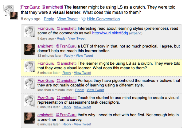
Initially, I was concerned about this and wondered what that meant for learning in our classroom (by nature of the subject area, rather text-heavy). A conversation with a different Rebecca (@FrznGuru, a member of my PLN on Twitter) made me realize I needed to chat with Grade-7-Rebecca to find out what her reason was for including this tidbit of info:

So I chatted with Grade-7-Rebecca. Turns out, she’s not bothered by the amount of text in our class; she was quite open in telling me that she’s having no problems in English A class with our texts, but wanted me to know for any “future projects or things like that” so that I could help her by giving her visual cues. Fair enough!

My primary concern was wondering how to help a visual learner in a course where the strands of writing, listening, reading, speaking, and representing are also important, but Rebecca seemed to understand this quite well and knew that although reading and writing might not be her strengths, she needs to work on them. We ended up having a thorough (and useful, at least for me) conversation about learning in English class.

Other than Rebecca’s generous comments, I get plenty of tidbits from students offering suggestions, which I note, as to how I can help them and others learn more in class, such as these articulate ones:

Other thoughts I have that will help you helpme learn, are having reading classes. I really enjoy them, and it is nice to take a short break once in a while. We are then ready to learn after having a short break.

And:

I think spending a bit more time explaining what you need to do for blogging in the unit, such as the fact that you need to post your roles on the blog before each meeting would help me understand the unit quicker.

Both of the above examples are comments I appreciate very much because they are reminders of the finer aspects of my teaching I need to be mindful of as I plan.

Ah, but what about those comments that really make me go, “Hmmmm”? Next, an example of a student who challenges me to do more:

I think we should do more activities that are off our bums! I want to move more in english, and play games. I’m sure more people would like that too 🙂 It’s also a really entertaining way to learn! I also think that we could interact with more groups of people. If we get to talk with our friends it MIGHT (yes, I’m saying MIGHT) make us feel like English is more enjoyable, so we will look forward to it more than we already do! 🙂

So now I understand that perhaps in our first quarter, for this student, we weren’t doing enough to physically move around and socialize. And I’m already thinking, How can we move around more in our next unit, and beyond? These are the kinds of comments I love because they really do challenge me to reflect on my own practice and make changes to adapt to my students’ needs.
Other gems I appreciate are the comments where one of my students tells me that what they’ve learned this quarter isn’t in fact related to any of our curriculum content, but rather is about how they learn or why we learn. Some examples:

I have defenitly learned how to properly blog and reflect in this unit. I have also learned that when your in a group or group work going for one thing that you should make sure that your all on the same page or else if you contradict that person then the person that is assessing you they might see that your not prepared.

And this one from Grade 8:
In this quarter I feel that i have really got a better understanding of the topic theme: ‘Identity and Belonging’. I also feel that I have also learned more about myself in a sense that I have gotten to appreciate books such as ‘The Outsiders’ more.

Of course there are always the “Life is so hard” adolescent whinges here and there, like this one from Grade 9, in response to the sentence starter “What I don’t like about this class is…:

I didn’t like that we did not read the book, Animal farm, very often in class even though we were expected to read it at home

And again from Grade 9:

that it still is work.

But despite even these comments, I certainly find that the surveys I get from my students help guide me as a facilitator of their learning. I feel I not only have a better pulse on each of my classes, but I’m challenged to think of ways to reach each student that perhaps I would not have thought without their input.

And so, I’ll continue to solicit their feedback! However, I think next time I do, I might change the way I do things and take Kevin‘s advice about using GoogleDocs Forms. Thanks, Kevin!  And of course, thanks to all my students for their honest and detailed feedback — especially Rebecca, who agreed to have me write about our conversation and her comments!

Like this? You might also enjoy these:

 21 November, 2008  Posted by at 7:21 am Assessment, Instructional Pedagogy Tagged with: , , , , , ,  1 Response »
Apr 102008
 

This article from the lovely Creative Commons Blog caught my eye today, particularly because the forum aims to look at “how digital technologies and new media are changing the way that young people learn, play, socialize and participate in civic life.”  Definitely cool (and no surprise that it’s being hosted at Stanford, either).   However, I am rather curious.  They say that proposed topics include:

  • Teen Socialization Practices in Networked Publics
  • Understanding New Media in the Home
  • Hip Hop Music and Meaning in the Digital Age
  • New Media from a Youth Perspective
  • (emphasis mine)

    I feel like this is one of those segments on Sesame Street:  “One of these things is not like the other.”  Socialization and networks – OK.  New media in the home and from a youth perspective – OK.   Hip Hop Music and Meaning – huh?  This stands out rather unusually to me.  My questions:

    • Why hip hop?  Why not other genres of music?  Or maybe there is another topic:  “Classical Music and Meaning in the Digital Age: from Chopin to Garage Band”?
    • Why only music?  Why not video, television, and podcasts? (although perhaps these are the other “new media”)

    Anyone else?

    Like this? You might also enjoy these: